2020
This design project was made as part of a collaboration between students from The Royal Danish academy, students from Parsons school of Design and the art museum SMK.
Aia Kragh
Johannes D. Shackinger
Sidsel Østbjerg
Ruby Wang
Nikki Sami
Johannes D. Shackinger
Sidsel Østbjerg
Ruby Wang
Nikki Sami
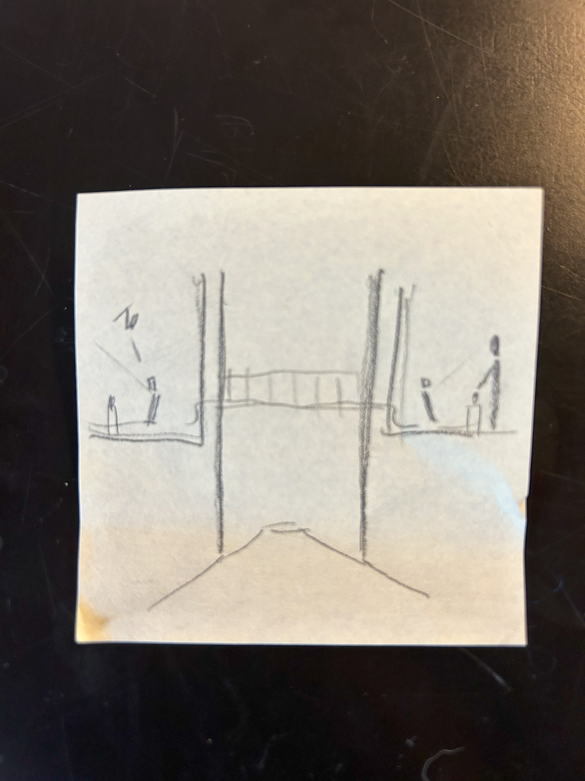
In this project, our objective was to seamlessly connect spaces and people across SMK. The design prototype showcased that only two screens and a line were needed to spark curiosity and forge connections between visitors and exhibition spaces. Given the museum's expansive collection spanning a vast time period, our design not only linked two areas but also symbolized a journey through time.
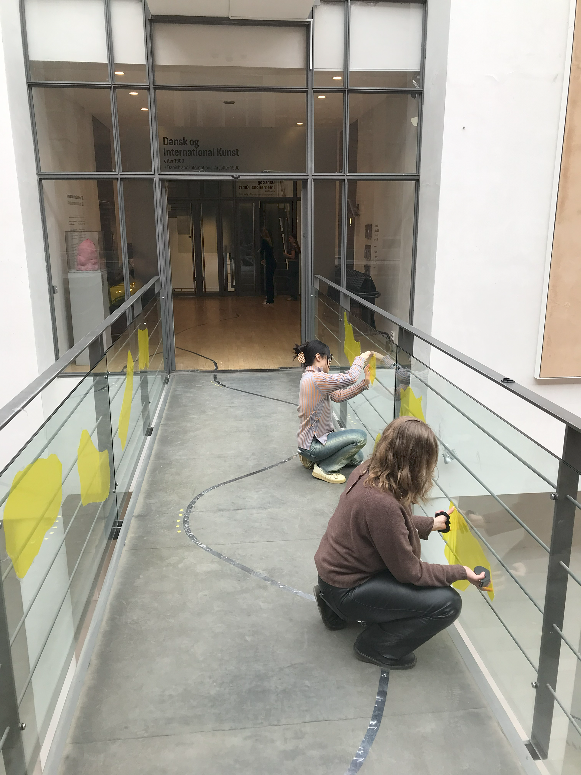
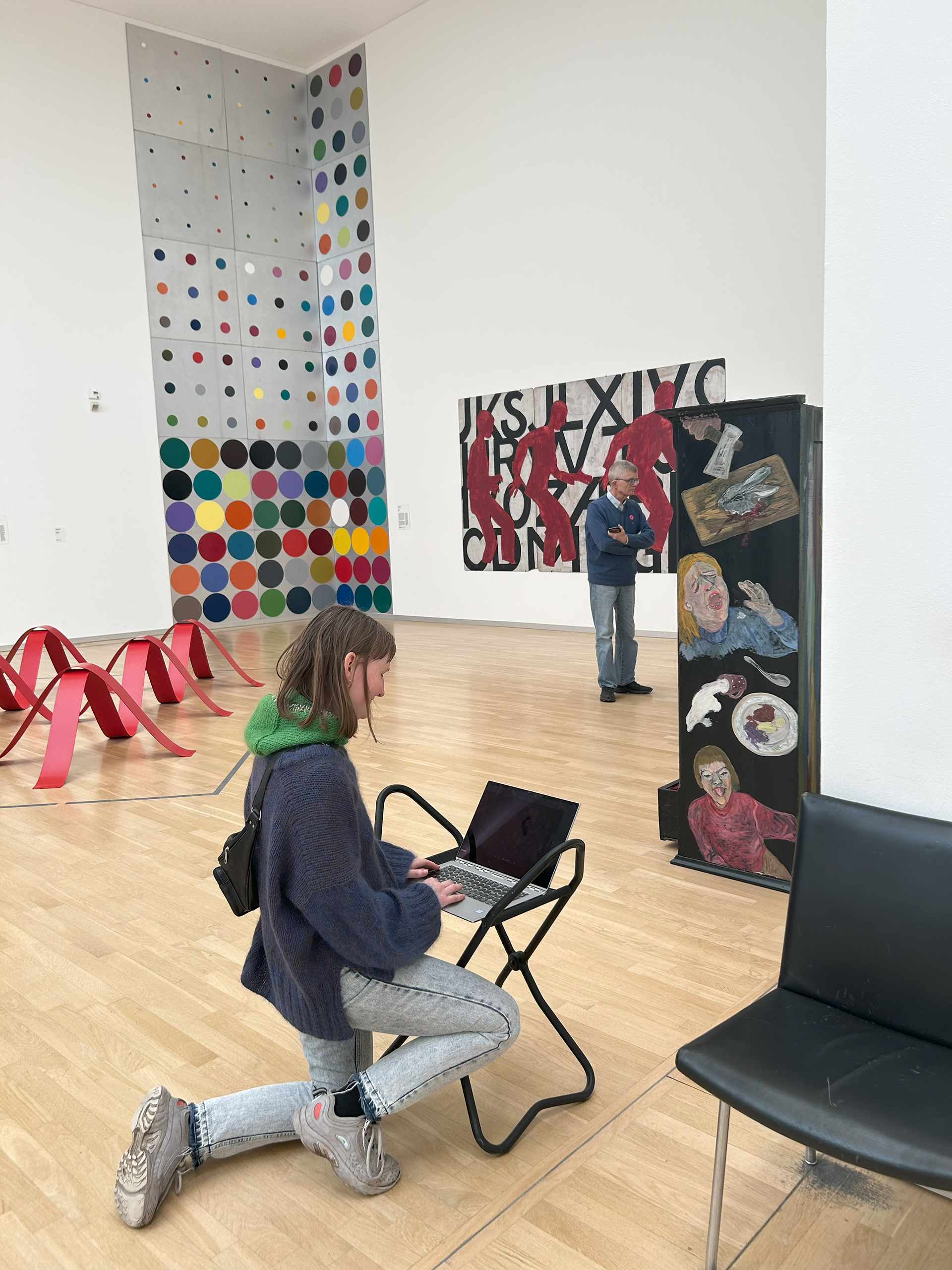
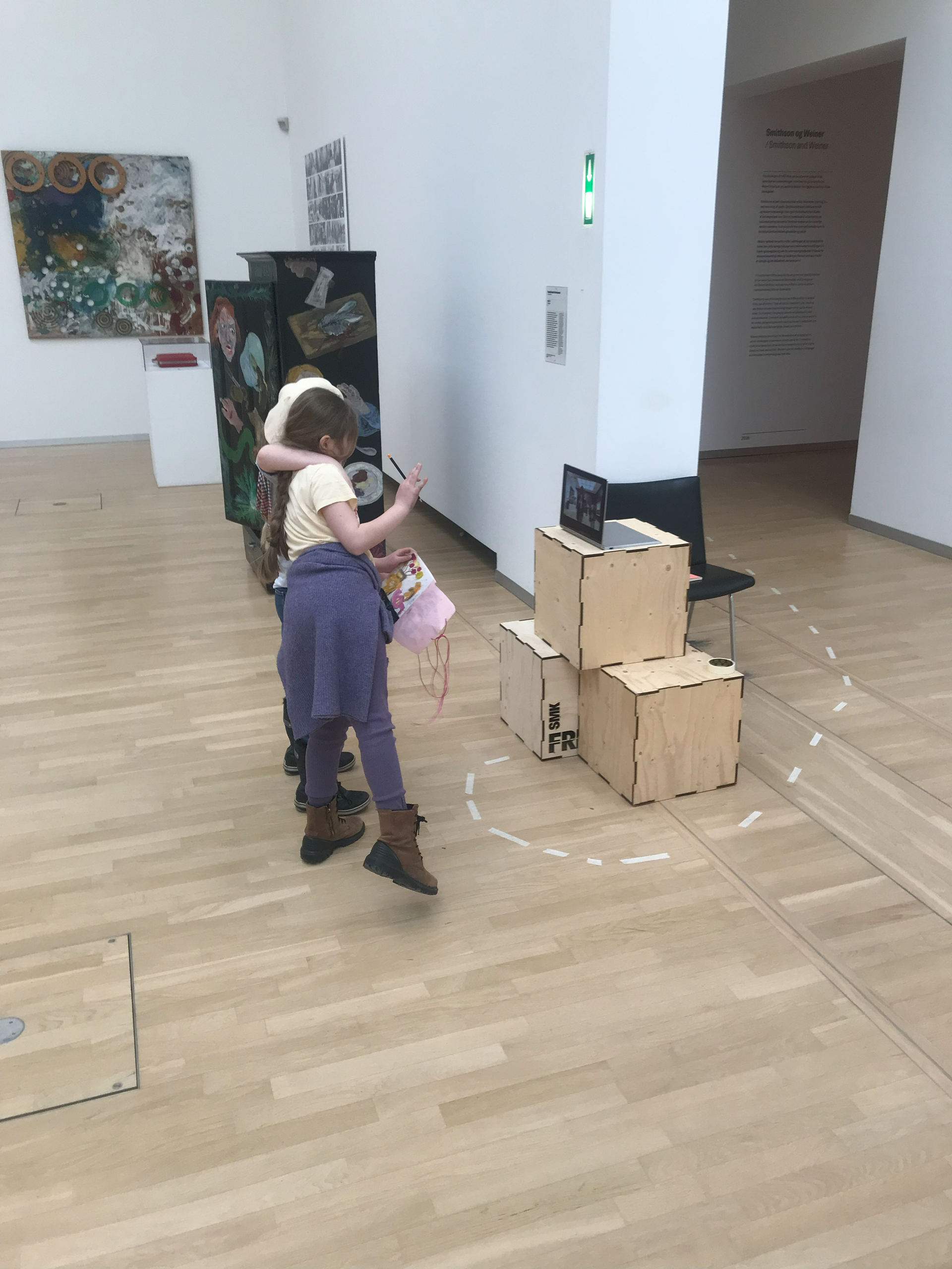
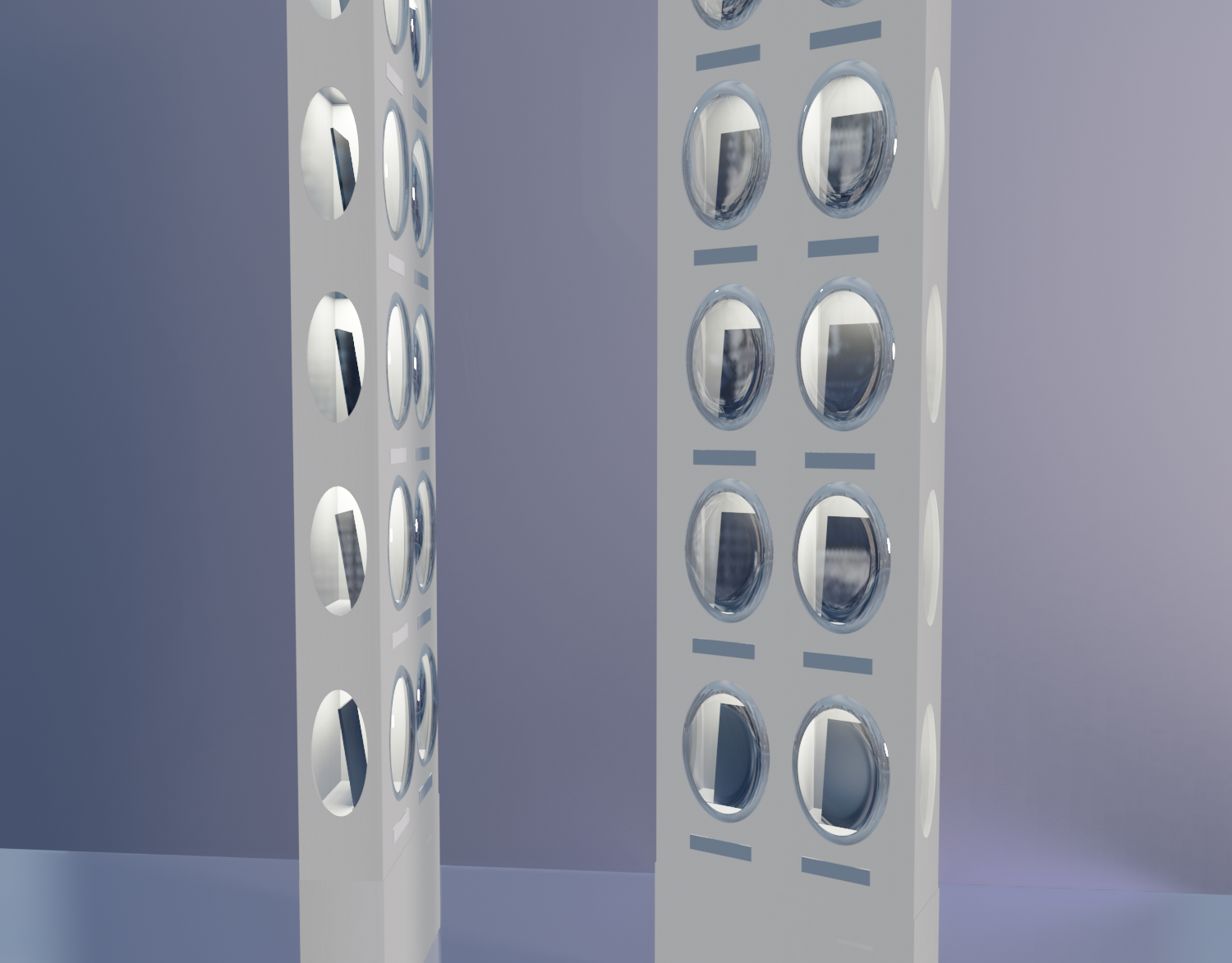
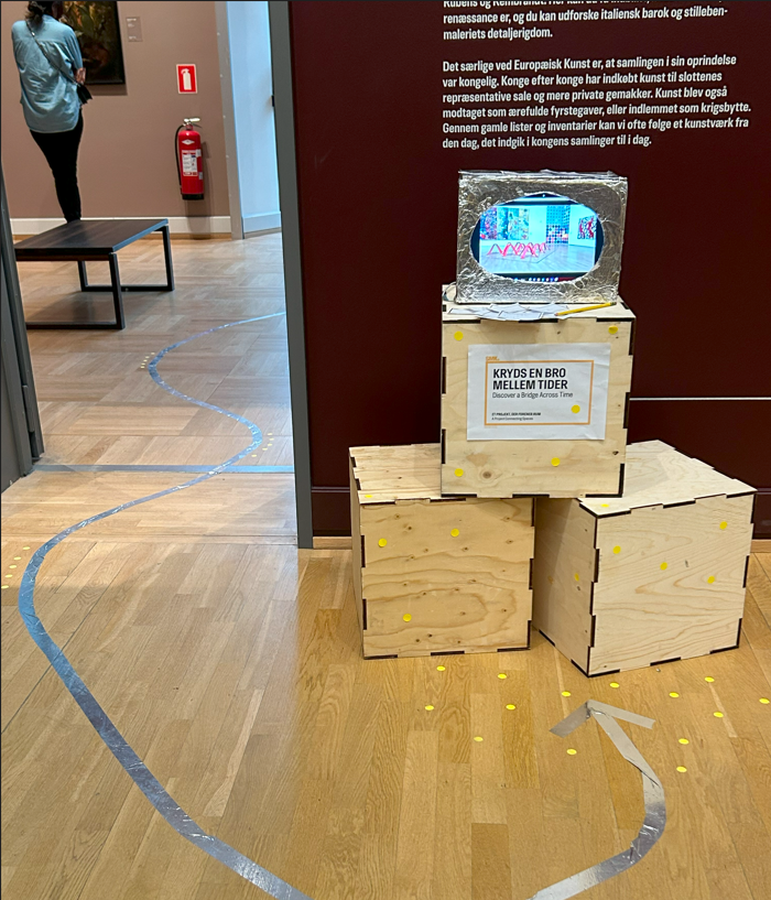
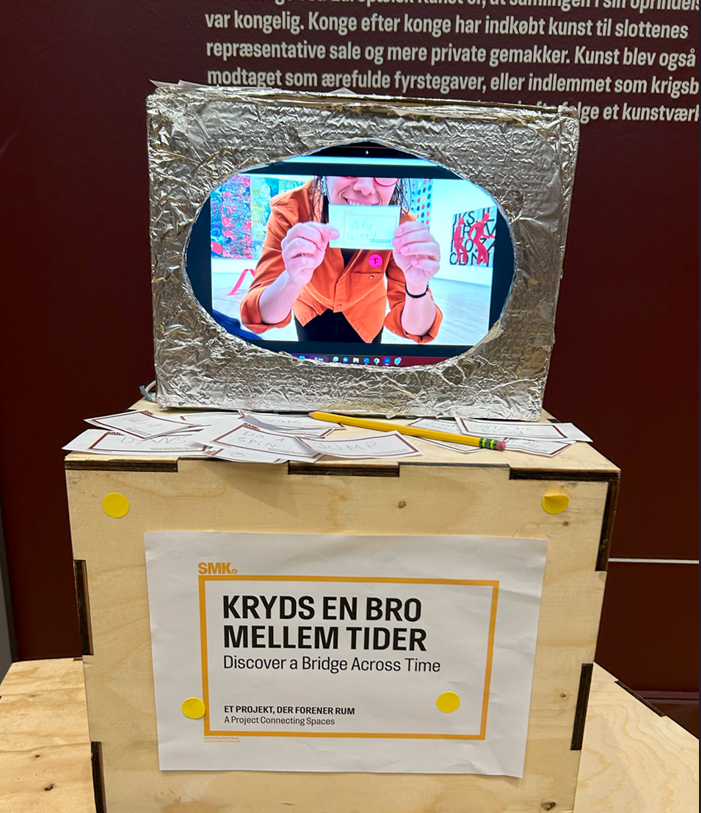
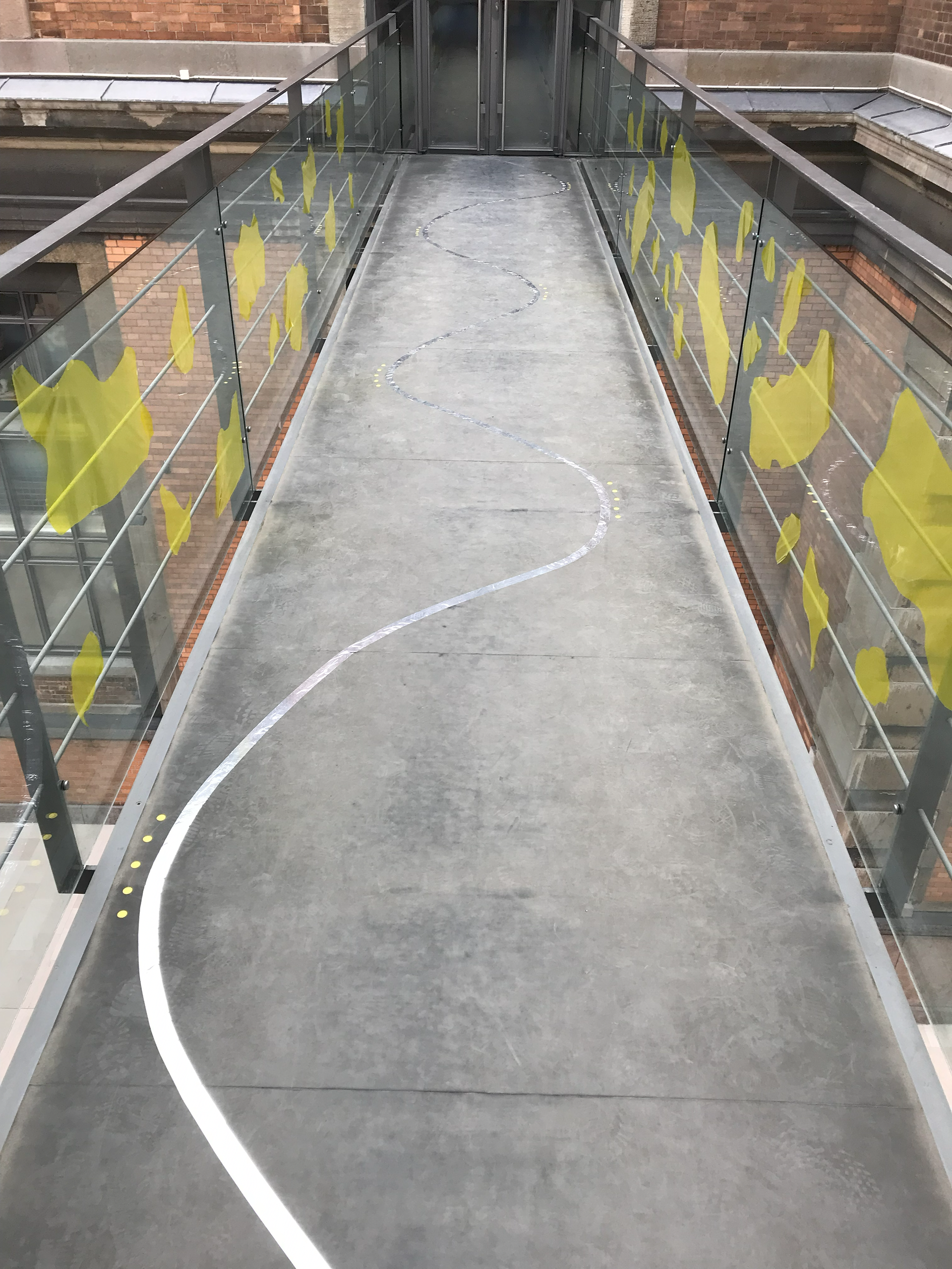
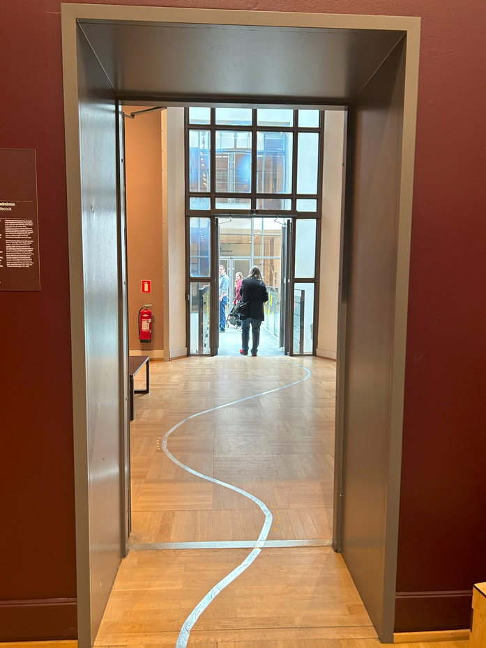
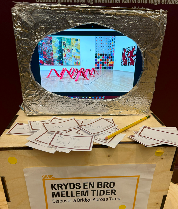
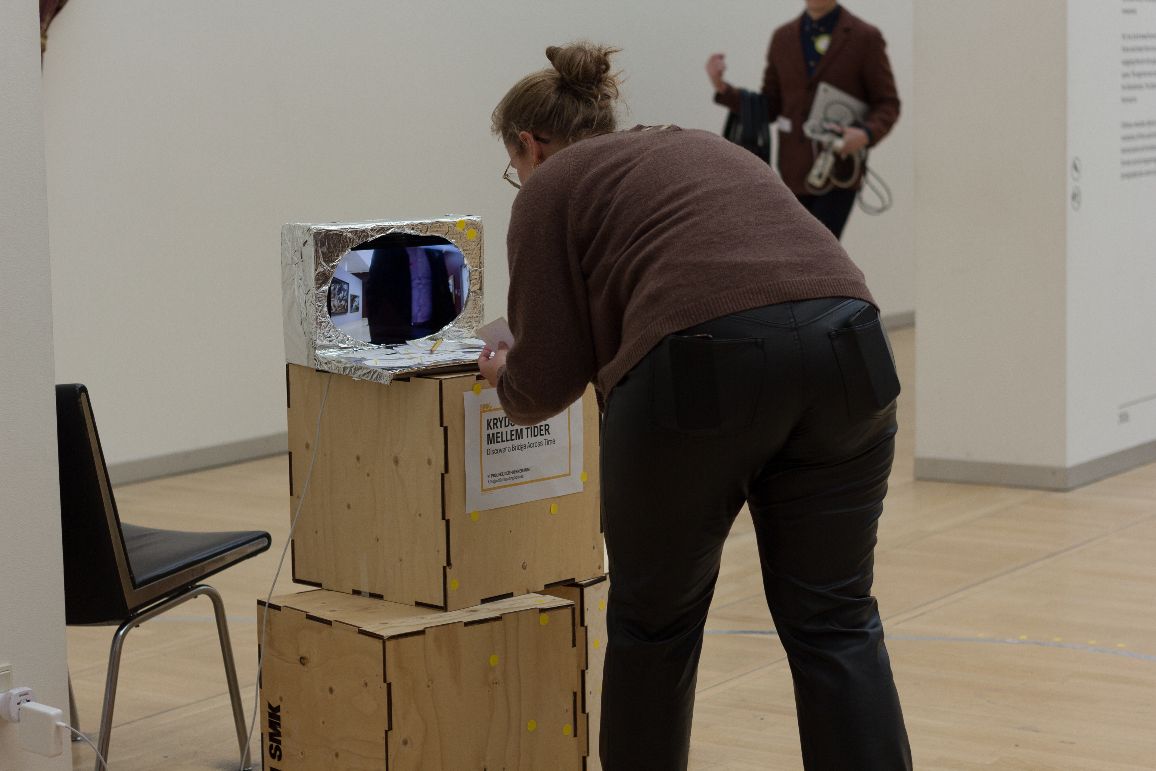
The final prototype featured two screens/cameras strategically placed on each side of the bridge, projecting images from the opposite side. Evolving with time, we introduced a floor line, physically intertwining the two screens and thereby connecting the spaces and the people within. Furthermore, we incorporated colorful elements onto the bridge, strategically designed to captivate visitors' attention and cultivate a welcoming and playful atmosphere.
The practical goals of the project include creating a connection between the old and the new part of the museum, improving wayfinding, increasing interactions between visitors and the museum, and drawing more attention towards the bridges and the contemporary building.
On the emotional side, the project aimed to create curiosity among visitors, make something surprising and engaging, and establish a shared memorable experience.
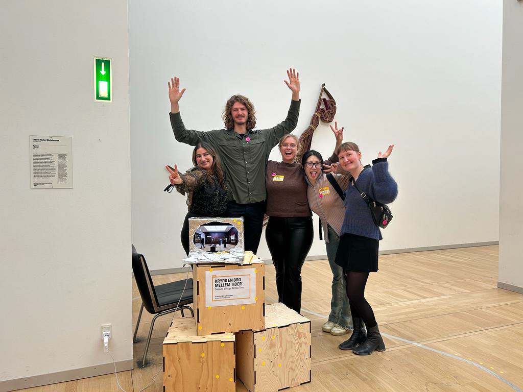


When design can create engaging visitors and playful behavior
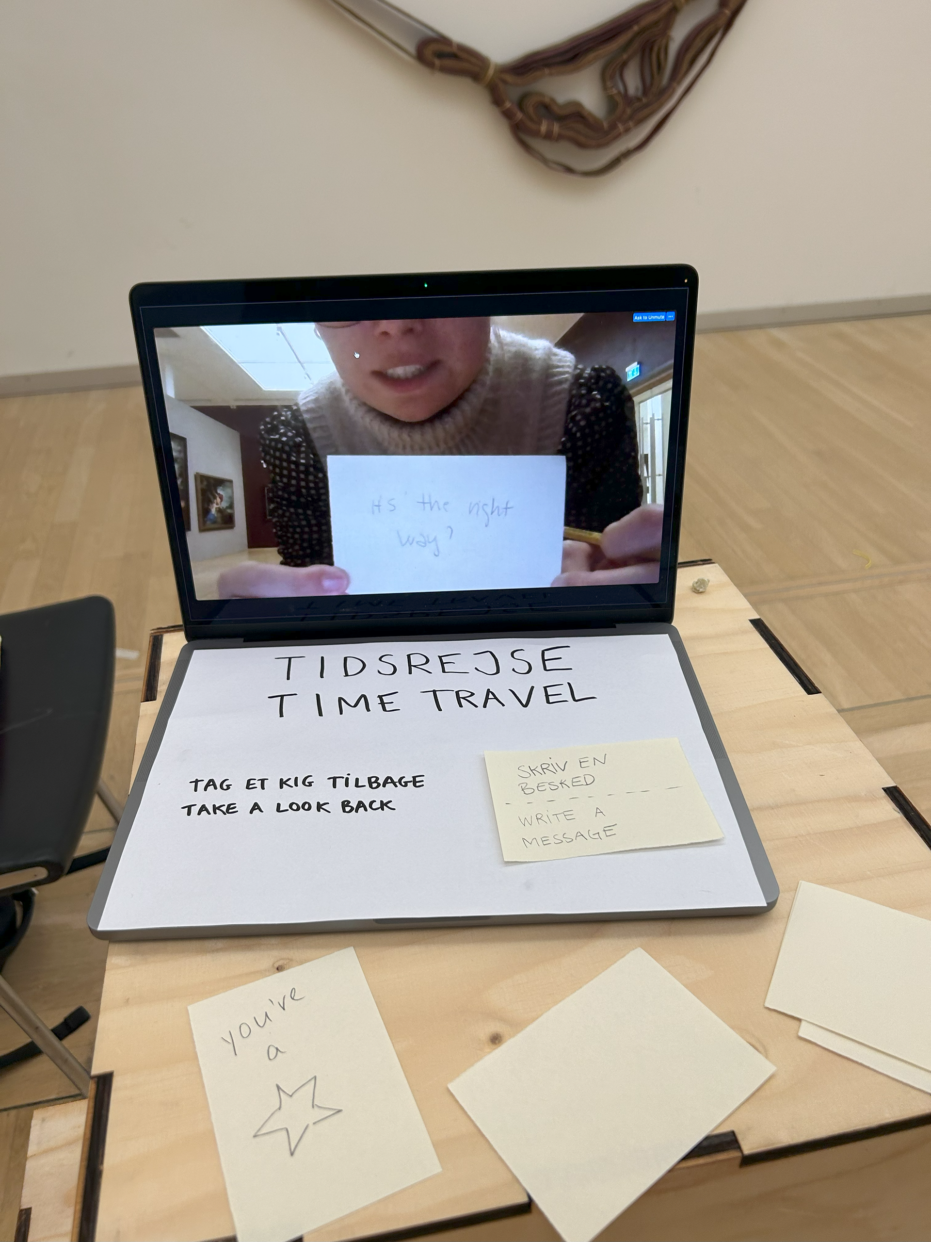
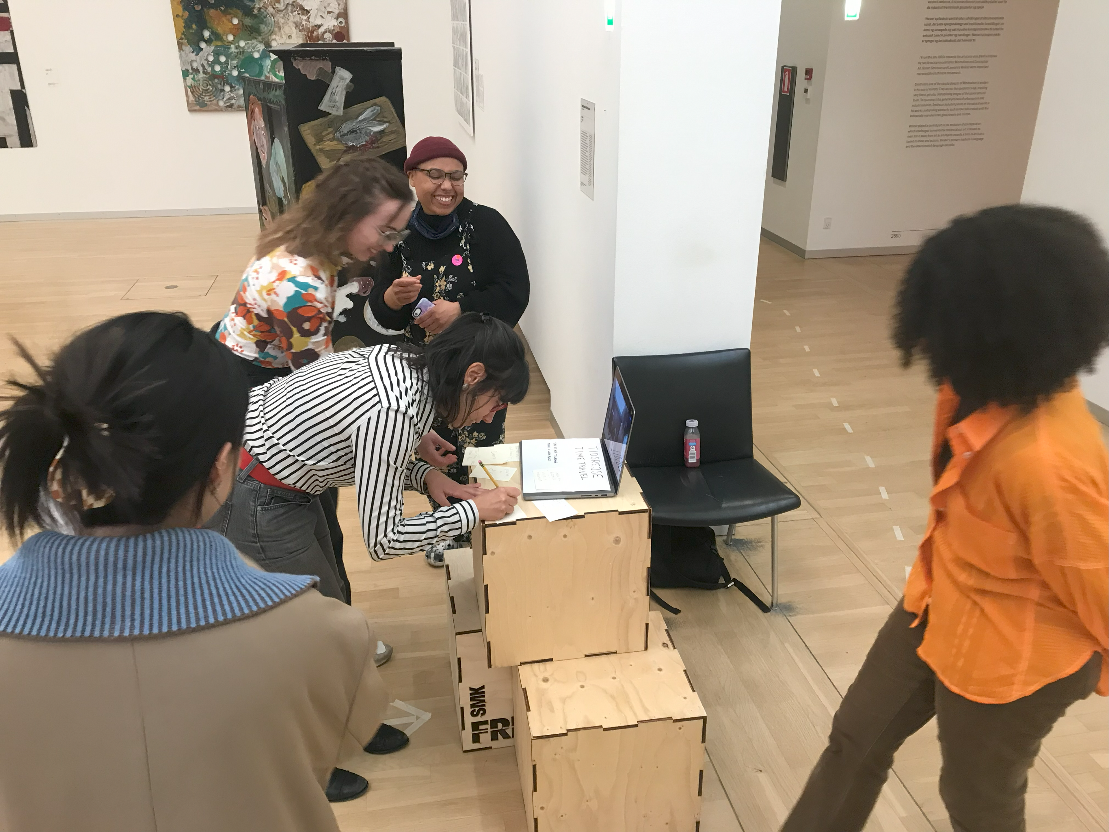
We received significant positive feedback on the design, with people finding it engaging and enjoyable during testing. The noticeable increase in smiles indicated a positive response. The interactive notes provided a means for communication, and prompts like jumping or dancing encouraged visitors to behave in a manner uncommon in traditional museum settings. The design resonated across age groups. Visitors expressed curiosity about the screens, prompting some to actively seek out the other location. The indicators leading to the bridge raised awareness of its presence and clarified that it was open for crossing.
The museum's contact person also expressed positivity, suggesting the potential use of a similar concept to connect the Copenhagen museum with a new part opening in Aalborg.
In essence, "A Bridge Across Time" not only physically connected two spaces but also served as a metaphor for a journey through time, bridging one building to another. The screens effectively captured visitors' attention, engaging them in a playful manner. A noteworthy practical outcome was the increased attraction of visitors to the modern and contemporary part of the museum.
Proces and prototyping
Throughout the prototyping process, each test phase contributed to the evolution of the concept.
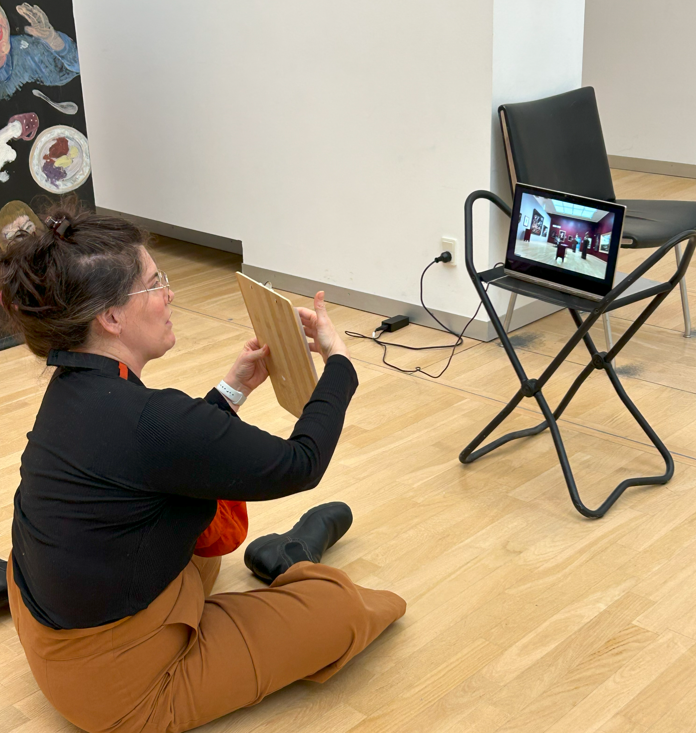
Our initial test involved using two computers connected via Zoom. Strategically positioned on either side of the bridge, the front camera output was hidden, and sound was muted to focus solely on visual interaction.
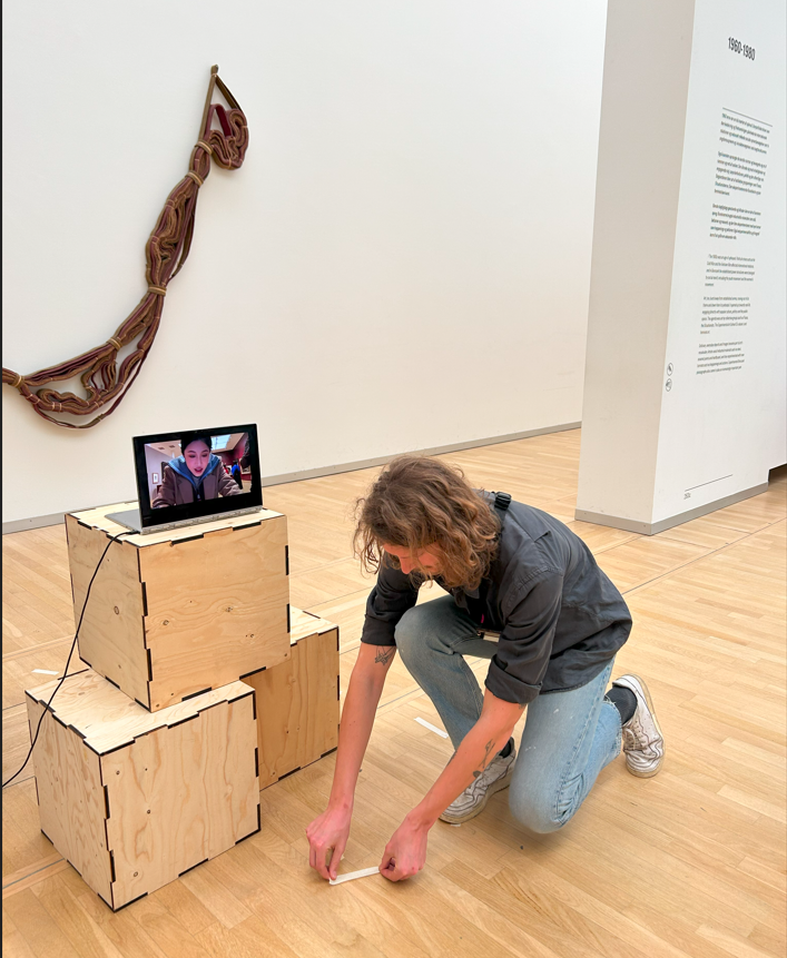
For the second test, tape lines were introduced on the floor, serving as a visual link between the locations of the two computers. This subtle addition enhanced the spatial connection between the separated museum spaces.
In the third and final test, the design was refined by incorporating playful wayfinding indicators. This included enclosing the computers in boxes, which purpose was to mask the computers as futuristic elements in a time machine. At this stage we also introduced writable notes, engouraging the users to communicate with each other.
